I have chosen to adopt past strategies employed by tobacco advertisers to raise awareness of a 'revolutionary' e-cigarette (that is being faltered by contemporary health labels). Through my dissertation it was continually illustrated that, the ability of tobacco advertisers to react to cultural and social change was striking. With this in mind, I wanted to demonstrate that the subculture, E-cigarettes, can also employ such strategies to work in a contemporary social climate. This idea builds on the end part of my dissertation, by the fact that E-cigarettes are already adopting past strategies of tobacco advertisers in their emergence.
Just as cigarettes were, when they first became socialised, e-cigarettes are seen to be healthy in some aspects, this is due to how new they are and the availability of findings to support claims of them being unhealthy (As demonstrated in my dissertation) My practical illustrates how the emergence of the E-cig has been effected by the rise of the tobacco industry and how they manage to react to experiences encountered in the changing pace of culture.
Part 1i) Health regulators have learned from the way e-cigarettes are advertising and 'recycling the past' of tobacco advertisers and thus created a more direct and shocking health label to try and abolish the idea that smoking electronic cigarettes is in some way beneficial. Introducing such new health labels for the e-cig demonstrates a progression on behalf of the health regulators, as they've learned from the tactics of the tobacco industry who were continually faltering such claims that it was damaging to health. Demonstrating an application of theory.
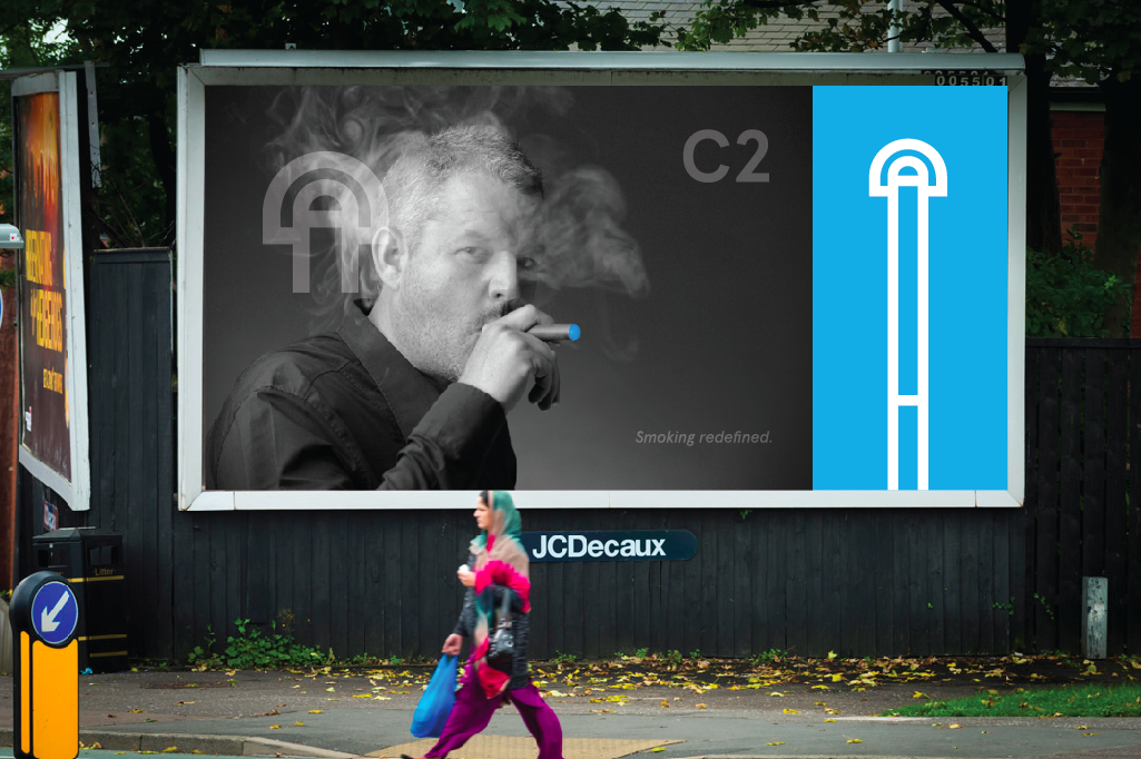
Part 2) However now the C2 has emerged, and it is pitching the male audience. Just as 'Torches of Freedom' created equality for females. The C2 aims to give back the mastery of the phallus to the male. Promoting ideas of: oral pleasure, the ideal man, bravado, a mastery of the phallus (cigar).
Part 2) However now the C2 has emerged, and it is pitching the male audience. Just as 'Torches of Freedom' created equality for females. The C2 aims to give back the mastery of the phallus to the male. Promoting ideas of: oral pleasure, the ideal man, bravado, a mastery of the phallus (cigar).


Promotional publication - (make reference to the front cover & concept of moving with the times, taking inspiration from the past, marlsboro - shape and form. remembered as red for burning. Blue shape and form, remembered as e-cig, the future.

I used an extended version of the logo to strengthen the idea of it being an electronic cigarette while also enhancing the ideas of the man.


I used snappy text just as tobacco advertisers did, to promote the idea that it is ultimately upto the consumer to chose, accommodating to their ideals, despite health warnings, it should be their individuality that speaks for them. And what the e-cig is trying to portray, is that it represents an ideal man who is strong and as one being.
Poster designs...


The following symbols are representations of technological parts, promoting the idea that the e-cigarette has redefined smoking, through its technological advancement.


As most of the promotion for e-cigarettes is done online, I created a web presence that worked fluently with the concepts in my designed identity: www.c2thefuture.com


The label below was introduced after the C2's release, the health regulators decided to step in again and stop this scapegoating that was so prevalent in the history of tobacco advertising, and judging by the way e-cig is following suit, health regulators thought the best way would be too create a health label primarily for C2 - the health label represents a direct attack on the messages that are trying to be portrayed by C2. The intentions where to stop this e-cig becoming a form of symbolism for the modern man. Drawing reference from the idea that it represents a phallus and challenging ideas that it won't be standing tall like the subliminal ideas suggest behind C2's identity.

Developmental screenshots...


I chose the following colour scheme because it represented a very manly collection of colours that suited the contemporary climate.

I chose to use the following types of Apercu text because it was a sans serif font and was a contemporary typeface, again fitting in with contemporary climates.


No comments:
Post a Comment