Latest Entries

Thursday, 16 January 2014

OUGD 601 - Evaluation

What skills have you developed through this module and how effectively do you think you have applied them?

This module has definately seen an improvement in my abilities to gather quantitative and qualitative data related to my subject matter, it has also improved my literature skills, enabling me to triangulate more effectively and with more reason to my points. The structure of my essay has seen an improvement on my last two, when reading through it, I notice that each section leads nicely onto the next and it all ends with a valid point that has been reinforced throughout my study. Because of these skills improving, I was left with a rich body of information that I could draw various ideas from and apply to my practical. I'd say the most obvious skill I've developed is the ability to write a substantial amount of literature, supported by findings, theories and primary research. Without blabbering on and straying from the point of my question. The most obvious skill I've developed in my opinion, is the ability to synthesise my findings into a practical approach. I tried to make sure that every aspect of my practical work, emulated what I'd discovered through my essay findings.

What approaches to/methods of design production have you developed and how have they informed your design development process?

I've developed my skills in extrapolating the right information from experiments and interviews. In the past a lot of my primary research, for example: questionnaires. Wouldn't really give me any solid evidence to support my findings and would sort of act as a signifier that I've undertook primary research, however this time I was provided with relevant answers that impacted on my focus, and thus could be carried through to my practical work, e.g. the branding of C2.

What strengths can you identify in your work and how have/will you capitalise on these?

My growing knowledge of advertising and psychoanalytic techniques has drastically improved over these past 3 years, and it was during this module that I fully grasped concepts and could talk fluently about my subject matter and also back it up with examples. I'd say a strength in my work, is the aesthetics of my practical, after showing a few peers, they instantly recognised its meaning and thought it was clever that it worked simultaneously as an e-cig. Therefore I think the synthesis between my written and my practical is a strong aspect as I feel that the theory has been applied with success and it is clear to see it in action.

What weaknesses can you identify in your work and how will you address these in the future?

I could of more-so improved my essay structure, however I didn't have enough time left, without jeopardising the practical aspect. Therefore my time management is clearly a weakness, which can be improved by planning earlier and working smarter rather than harder. I could of also generated a broader amount of ideas and conceptual strengthening, however I felt my idea for practical was strong, but the fact I didn't generate more means I could of generated a better idea. In the future I need to make sure I exhaust all of my design ideas. A weakness would be that I feel my blogging could of been more broader as I spent a lot more time on the writing and practical side of things.

Identify five things that you will do differently next time and what do you expect to change from doing these?

1. I could of undertook primary research into the e-cigarette and emailed various companies, bringing up the idea of the tobacco industry impacting on their advertising, this would of given me the opportunity to gain insight into an area that is mostly speculation at this time.

2. Structure my time more effectively - making my ideas too ambitious and trying to do more than possible, resulted in me not being able to produce more final deliverables. 


3. Given more time, or by depleting one of my deliverables, I could of focused my attention to actually coding the website. Doing this would of meant I could of introduced my concept into the real world.

4. Resolved an idea for my practical at an earlier date, so I would of had more time to complete deliverables. I spent far too much time developing my concept and trying to tie in every aspect of my practical.

5. If I'd of had the opportunity, I would've started my dissertation research in the summer, allowing for more time on my practical.

How would you grade yourself in the following areas (5 - excellent to 1 - poor):
•    Attendance: 4
•    Punctuality: 4
•    Motivation: 5
•    Commitment: 5
•    Quantity of work: 4
•    Quality of work: 5

•    Commitment to the group: 4

OUGD 601 - Practical - Brief/ Rationale EXTENDED VERSION

For the practical side of the CoP3 project the aim has been to synthesise the research findings from the written study­ with a designed practical outcome. 

I have chosen to adopt past strategies employed by tobacco advertisers to raise awareness of a 'revolutionary' e-cigarette (that is being faltered by contemporary health labels). Through my dissertation it was continually illustrated that, the ability of tobacco advertisers to react to cultural and social change was striking. With this in mind, I wanted to demonstrate that the subculture, E-cigarettes, can also employ such strategies to work in a contemporary social climate. This idea builds on the end part of my dissertation, by the fact that E-cigarettes are already adopting past strategies of tobacco advertisers in their emergence.

Just as cigarettes were, when they first became socialised, e-cigarettes are seen to be healthy in some aspects, this is due to how new they are and the availability of findings to support claims of them being unhealthy (As demonstrated in my dissertation) My practical illustrates how the emergence of the E-cig has been effected by the rise of the tobacco industry and how they manage to react to experiences encountered in the changing pace of culture.

Practical, Scenerio;

Part 1i) Health regulators have learned from the way e-cigarettes are advertising and 'recycling the past' of tobacco advertisers and thus created a more direct and shocking health label to try and abolish the idea that smoking electronic cigarettes is in some way beneficial. Introducing such new health labels for the e-cig demonstrates a progression on behalf of the health regulators, as they've learned from the tactics of the tobacco industry who were continually faltering such claims that it was damaging to health. Demonstrating an application of theory.

Part 2) However now the C2 has emerged, and it is pitching the male audience. Just as 'Torches of Freedom' created equality for females. The C2 aims to give back the mastery of the phallus to the male. Promoting ideas of: oral pleasure, the ideal man, bravado,  a mastery of the phallus (cigar).

Part 1ii) After the C2's release, the health regulators decided to step in again and stop this scapegoating that was so prevalent in the history of tobacco advertising, and judging by the way e-cig is following suit, health regulators thought the best way would be too create a health label primarily for C2 - the health label represents a direct attack on the messages that are trying to be portrayed by C2. The intentions where to stop this e-cig becoming a form of symbolism for the modern man. Drawing reference from the idea that it represents a phallus and challenging ideas that it won't be standing tall like the subliminal ideas suggest behind C2's identity.

In terms of deliverables, I wanted to design, using only applicable mediums. Throughout my dissertation I discovered that the e-cig was heavily promoted through the ever increasing size of the internet and point of sale displays. It was taking advantage of modern forms of communication just as tobacco advertisers had done during its early days (mass production). In light of this, I created a web prescence that was applied to modern forms of communication, and used outdoor promotions and point of sale techniques to encourage the identity among society. Creating a leaflet, publication, poster designs and packaging ideas.

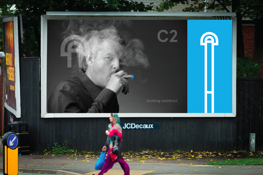
Due to the fact that C2 was a contemporary e-cigarette brand, trying to permeate ideas of the ideal man and a mastery of the phallus greater than women. The identity had to coincide with these messages. Which is why I created a very modern symbol that looked like an e-cigarette with smoke emitting. BUT also looked like a phallus which represented oral desire. The ideas of the ideal man were permeated through the advertisements, depicting a cool character who men would aspire to. 


The name C2 was chosen because it not only represents the technological aspect of the electronic cigarette. But it also refers to the fact it is a sub-culture and is the second cigarette. Furthermore the web aspect that C2 is predominately promoted through will bear the following web name: www.C2thefuture.com. 


Wednesday, 8 January 2014
OUGD 601 - Practical - Photography

 I've developed a set of deliverables that mimic tactics of the tobacco advertisers who have a strong ability to react to current situations, alongside the ideology of electronic cigarettes who are following in the footsteps of its predecessor, the cigarette. Using emotion to appeal to their consumers and applying brand differentiation to target individuality within consumers. Furthermore, Health labels have been introduced with a more direct approach because of the learnt lessons from the history of tobacco and its ups and downs.

-The following card is for point of sale displays that would simply work in conjunction with the publications deliverance. During the developmental process, I experimented with the construction of cigarette packaging and the idea was to create a point of sale to be used in shops that would hold my designed publication, promotional card & also postcards of the advertisement displaying the ideal man.


The publications primary purpose is to advertise the website of the product and also pitch why it is C2 the MAN should choose. This approach has been designed in relation to a mastery of the phallus and seeking back this reputation that they used to have before such events as 'torches of freedom'...


The following health labels are fully explained in 'Part 1' Blogpost.


(Left) Initial health label that was introduced.
(Right) Health label that was introduced in relation to the emergence of the E-cig, C2.

Wednesday, 1 January 2014

OUGD 601 - Practical - Initial design generation/ direction development

While anti-tobacco efforts continue and gain strength, the introduction of electronic cigarettes into the 21st century has been marketed as a less harmful alternative to cigarette smoking, supplying nicotine through inhaled water vapour. One must use history as a referent to understand these implications. During the introduction of tobacco, advertisers regarded cigarette smoking as having certain health benefits, it was only due to a lack of evidence that such bizarre claims were digested. Now consumers are once again finding themselves in a position to accept this marketing strategy as the introduction of the e-cigarette is still new and bears no solid evidence for its effects. Will this repeated use of strategy fail just as it did in the tobacco industry? Only time will tell. And I hope to create this effect through the development of my practical, demonstrating my synthesis of my findings and demonstrating how I've applied theory to my practical.

----


As a starting point I began illustrating various designs that could be simplified digitally if I was going to choose them. Initially I found it quite hard to develop a logo that would target the male audience with the meaning of the ideal man embedded. But when I started to see the cigarette as a symbol of phallic power and a symbol of modernity and emancipation for men to regain a mastery of the phallus, (relation to torches of freedom scenario) . I was able to develop a logo that emitted the idea of oral desire and phallic symbolism. But also a logo that shows the beam off the lights on the end of the electronic cigarettes.


Refer to black book supplied in submission. This will show an in-depth, conceptual development of my ideas and direction for my deliverables.

OUGD 601 - Practical - Noting design


The image above displays the manipulative techniques that advertisers from the tobacco industry are known for, applying the style of the past, but in a contemporary medium.


The government has the right to obtain a space on any type of product and promote its message whether the public like it or not… 


E-cigarette logo...


Although the e cig is being marketed as a healthy alternative to cigarettes, it also has a higher rate of nicotine which when used excessively can lead to the certain side effects of nicotine illustrated below...


In the same manner Marlboro created their strong and impressionable design, I want to use sharp shapes to create the design for the outer covers of my publication deliverable, 


OUGD 601 - Primary research

Interviews/ data collection/ quantitative & qualitative information.

Interview - Qualitative data - The daughter of a 'greaser', her father worked at 'British American Tobacco' for 30 years, he started just after the war in 1945.

I was presented with the chance to interview her through my dad, my aim was to ask open ended questions which she could then expand on and supply me with a rich source of information. Hopefully I could extrapolate some strong points.

Questions asked… While working at British American tobacco, how was your father looked after?

Could you tell us about his roles in the tobacco industry?

Did many people work there?

Was the idea of smoking also passed onto workers, as well as the consumers?

"It wasn't a well paid job, but he was paid weekly. His job was a greaser, every morning he would grease all the packing machines, so they worked smoothly and efficiently for the day.

It wasn't automated back then, and he had to look after all the cigarette box packing machines. During the day, any machines that stopped working, Jack was asked to fix.

He was jovial (happy) at work and got on well with his work friends and the majority of women working there heavily outweighed the proportion of men working there.

It was very noisy and there wasn't any protection or health and safety in those days.

Started work in 1945.

Approximately 800/ 900 staff.

Machines running most of the time , workers got paid a flat wage i.e. no incentive or bonus schemes.

Majority of people smoked at the factory and got a discount on cigarettes due to working there.

Jack didn't talk much about working at BAT.

Started work at 7:00am and finished at 5:00pm, Got to work by bus and train.

Cigarettes were exported around the world but majority at the Liverpool plant were for the UK. Jack smoked constantly and smoked a brand called 333" and then 555"

Jacks vocal chords twisted due to his constant smoking and got Lung cancer. Had one of his lungs taken out due to lung cancer.

Got glass vase due to his long continued service.

The following photographs were primary evidence that the daughter of Jack let me photograph...


What can I learn from this interview? Well it strongly suggests that the introduction of modern technology at the time (lithographic machines, bigger, faster printing presses) created a large supply and demand that tobacco advertisers were trying to compete with, hence the amount of employers and fact that it was proportionally machine operated. Jacks job role also illustrates that the machines were of great importance. One of the most important points that was brought to light during this interview was the fact that the majority of women working there were women. Coinciding with the war, womens social status was changing and women were beginning to take on roles of men in society, this is clearly demonstrated by the proportion of women working in the factory following the war.

Experimental study / Practical Questionnaire - Quantitative data

Control group - 10 participants - Smokers

The only information that was given to my control group was that it was an investigation into the effects of brand differentiation.

The purpose of this study was to demonstrate:

Whether brand differentiation was superficial and simply a method of promoting the act of smoking itself (through the matching of desires and attitudes in advertising)

OR

Whether brand differentiation permeated into the taste and blend of tobacco itself, creating a product that was distinguishable from others.

------------

Was brand advertising promoting ideas of conformity through representations of individuality? Using 5 different high-street brand of cigarettes: Marlboro, Lambert and Butlet, Embassy, Lucky Strike, Pall Mall. I was able to distinguish that the majority when blindfolded couldn't recognize the difference in tobacco blends, from this we can infer that brand differentiation in advertising is a driving force to create conformity through the representations of individuality.

Results

The cigarettes were smoked in the same order for each participant, noise levels were kept at a minimal level to allow for concentration. In-between the smoking of a cigarette, a list of 5 brands were placed in front of the participant, who was then asked to circle what brand they thought they'd smoked.

90% of the control group were unable to recognise a brand of cigarette they were familiar with when asked to smoke blindfolded. Strongly suggesting brand differentiation was superficial and simply a method of ultimately seeking conformity.

Tuesday, 31 December 2013

OUGD 601 - Practical - Products

I have chosen to adopt past strategies employed by tobacco advertisers to raise awareness of a 'revolutionary' e-cigarette (that is being faltered by contemporary health labels). Through my dissertation it was continually illustrated that, the ability of tobacco advertisers to react to cultural and social change was striking. With this in mind, I wanted to demonstrate that the subculture, E-cigarettes, can also employ such strategies to work in a contemporary social climate. This idea builds on the end part of my dissertation, by the fact that E-cigarettes are already adopting past strategies of tobacco advertisers in their emergence.

Just as cigarettes were, when they first became socialised, e-cigarettes are seen to be healthy in some aspects, this is due to how new they are and the availability of findings to support claims of them being unhealthy (As demonstrated in my dissertation) My practical illustrates how the emergence of the E-cig has been effected by the rise of the tobacco industry and how they manage to react to experiences encountered in the changing pace of culture.

Part 1i) Health regulators have learned from the way e-cigarettes are advertising and 'recycling the past' of tobacco advertisers and thus created a more direct and shocking health label to try and abolish the idea that smoking electronic cigarettes is in some way beneficial. Introducing such new health labels for the e-cig demonstrates a progression on behalf of the health regulators, as they've learned from the tactics of the tobacco industry who were continually faltering such claims that it was damaging to health. Demonstrating an application of theory.

Part 2) However now the C2 has emerged, and it is pitching the male audience. Just as 'Torches of Freedom' created equality for females. The C2 aims to give back the mastery of the phallus to the male. Promoting ideas of: oral pleasure, the ideal man, bravado,  a mastery of the phallus (cigar).


Promotional publication - (make reference to the front cover & concept of moving with the times, taking inspiration from the past, marlsboro - shape and form. remembered as red for burning. Blue shape and form, remembered as e-cig, the future.


I used an extended version of the logo to strengthen the idea of it being an electronic cigarette while also enhancing the ideas of the man.


I used snappy text just as tobacco advertisers did, to promote the idea that it is ultimately upto the consumer to chose, accommodating to their ideals, despite health warnings, it should be their individuality that speaks for them. And what the e-cig is trying to portray, is that it represents an ideal man who is strong and as one being.

Poster designs...


The following symbols are representations of technological parts, promoting the idea that the e-cigarette has redefined smoking, through its technological advancement.


As most of the promotion for e-cigarettes is done online, I created a web presence that worked fluently with the concepts in my designed identity: www.c2thefuture.com


The label below was introduced after the C2's release, the health regulators decided to step in again and stop this scapegoating that was so prevalent in the history of tobacco advertising, and judging by the way e-cig is following suit, health regulators thought the best way would be too create a health label primarily for C2 - the health label represents a direct attack on the messages that are trying to be portrayed by C2. The intentions where to stop this e-cig becoming a form of symbolism for the modern man. Drawing reference from the idea that it represents a phallus and challenging ideas that it won't be standing tall like the subliminal ideas suggest behind C2's identity.


Developmental screenshots...


I chose the following colour scheme because it represented a very manly collection of colours that suited the contemporary climate.


I chose to use the following types of Apercu text because it was a sans serif font and was a contemporary typeface, again fitting in with contemporary climates.


About Me

My photo
Leeds College of Art. Graphic Design.
 

Copyright 2010. All rights reserved.