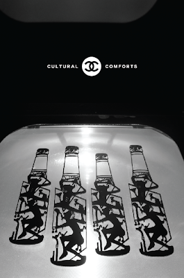
After photographing my selected emotional products, I tried to digitally enhance my designs by forming 2 separate patterns to include in my publication and supportive material. As you can see below the pattern consists of 3 products repeated. The other pattern can be found within the printed publication.
The reason for such an exhibition was to show viewers how products have become popular in contemporary culture for the emotional messages that are tied to them. Advertisers are employing tactics to make viewers ultimately feel better about themselves. For the logo of my exhibition I thought it was appropriate to use the Chanel logo as it coincided with the title of my exhibition and was strongly suggesting the core message... Don't be deceived by what you see. The exhibition also takes on its cultural message of luxury which will theoretically be passed onto my exhibition.
Colour Scheme; I wanted the only colours visible at the exhibition to be those coming from the actual products. Everything else I wanted to be in black and white to give the exhibition a very contemporary and modernist appearance. The main reason for a black and white colour scheme is also... Giving you the truth, in black and white.
As the exhibition will be educational and informative. I decided that it would be a good idea to create a web based concept that could be accessed outside of the exhibition. Promoting peoples awareness and also injecting some fun into the educational side of things.
The game is based around selecting a core emotional driver that matches that of a certain product. Selecting the correct driver, will reveal the message tied to it.
Staff Uniform...
How the exhibition would look...
The black book found on the pillars represents the publication to read as you pass by each product. The white booklet would be my essay acting as supporting material for viewers to read, giving them a rich source of information surrounding the reasons for advertisers employing such tactics.
Entry ticket, Wristband & Lanyard


No comments:
Post a Comment