Archives

Sunday, 21 April 2013

Responsive / Collaboration, Fedrigoni, Previous submissions, creative paper

"Most Designers have a fetish (in the platonic sense) for paper stocks, we’re no different. Our obsession for all print work to be produced on GF Smith papers could be considered unhealthy. This blog is the result of a self diagnosis that we have a phobia of upsetting mr GF Smith. This blog is all about Fedrigoni; another fine paper maker. It is also an ode to the designers/artists/creatives who battle bloodied fingers to create these amazing models, statues, figurines and installations."


Laura Quantrill – Fedrigoni London showroom piece

Laura Quantrill is a Derbyshire based Graphic Designer, she was asked by Fedrigoni to create a piece that showcased their range of papers. Her main aim was to encourage designers to visit and use the Fedrigoni London Showroom.
Laura created a mail out designed to promote an exhibition of classic Italian design through out the twentieth century modeled out of paper. The designs include the Vespa, Sapper Alessi kettle and Olivetti typewriter model. The mail out contained the nets for each model giving the recipient there own classic Italian design to build.


These Elegant and Refined cards were created by Italian graphic design and marketing specialists GIOVANNI RUSSO GRAFICO. The attention to detail is immaculate. Can you work out the name and location of each building?


The Fedrigoni Mountains

An Installation produced for Fedrigoni designed and built by Graphic Designer Alex Ostrowski and London based Illustrator and set maker Hattie Newman. The idea was inspired by the snow-capped Dolomites surrounding Fedrigoni’s hometown of Verona. The brief was to visualise an imaginary exploration of the paper slopes.


2010 Fedrigoni calender

Last year we had a surprise visit from a Fedrigoni representative. He had dropped in to deliver us the latest Fedrigoni Calendar. Each year they re-invent their give-away calendar and each year it gets better. This years desk version draws its inspiration from Post- it notes, but radically reinvents the format.
Designed by Studio 8 and printed by Team Impression the calendar makes a practical yet design-led object suitable for any desk.


Fedrigoni London showroom posters

Posters were designed by Richard Nabarro a Manchester based Graphic Desiger. His challenge was to encourage more designers to visit and use the Fedrigoni London Showroom. In response, Fedrigoni paper, photography and digital manipulation were used extensively to create a set of posters. These designs emphasise the creative possibilities of paper.


Toby Edwards – Fedrigoni London showroom piece

Another promotional brief set by the YCN to promote the Fedrigoni London Showroom to designers. The aim: to promote the range of paper stocks that Fedrigoni produce.
This installation was designed and built by student Graphic Designer Toby Edwards. Using the event theme of ‘Tea & Biscuits’, the idea was to encourage designers to feel at ease in the space, through a traditional homely welcome. The ‘Tea & Biscuits’ identity was inspired by the shape of old biscuit tins circa 1930. The paper installation pieces are built up from the same decagon-shaped base.


After analysis of the previous work the ideas and concepts are all very strong, the only thing is that they're all one off sort of ideas, in the sense that once you've seen them, you've seen them. With the idea of tailoring each scene in our publication to an iconic scene in their area, making it personal to them while still communicating the messages it needs to. Printers can then be inspired by their tailored, local scenic publication.

Responsive / Feel Good Drinks YCN

Brief 1 / A new look for 'Feel Good'


We think our pack designs look good.  The designs are simple, colourful and impactful on shelf, the brand name is clear and most people get the fact that we are offering tasty, healthy drinks. 
However there is a risk that we’re being a little modest with our communication of some the main reasons to drink Feel Good eg no added sugar and 100% natural ingredients. We also want to ensure that we strike the right balance between the communication that our drinks are healthy and having label designs which makes people smile and feel good. 
We’re big fans of simple, uncluttered pack design, we like what we’ve got but recognise that the best designs are constantly evolving. The supporting information included in our project pack shows how our designs have evolved over the last 10 years, we’re up for change and would love to see some fresh ideas.


I was quite confused when I analysed the briefs deliverables, before it came to even drafting my designs, I wanted to make sure I was editing and designing the correct things.

As you can see it says the leaf changes depending on the fruits in the container, however when looking at all of 'Feel Good's' range below you notice that the leaf is consistent despite the change in flavours? the most plausible solution to this discovery would be too also incorporate this leaf in some manner...


Thinking about the leaf in such a manner has urged me to develop my own leaf and make its appearance one of the focal points of my design. As you can see it hasn't been included in the past designs but because 'Feel Good' are adapting to their cultural contexts, they've embraced the idea of promoting the 'healthy' aspect of their company and used a leaf on their most recent bottle label designs.


Using a leaf makes it quicker for the audience to recognise the 'healthy' aspect of the drink, this is backed up by the fact that if you took the leaf off of the images below, you'd be noticing nothing but circular shapes which could potentially pass as a million and one things. However, if you place the leaf on top of these designs, they're instantly recognised as fruit, vegetables and just natural healthiness.

Although I quite like the comical and refreshing message behind this advertisement, it seems quite cliche, other competitors such as 'RIBENA' adopt fruit characters to portray their juiciness and make the obvious jokes that were all too familiar with. I think they've got the basis of a good idea here already, but I can tell ALOT of people undertaking this brief will do something similar, trying to incorporate a personality into the fruits. I think If I end up taking this direction, I should focus on creating an identity with my range of packaging rather than just characters.


Although 'Feel Good' are a fan of minimalism, I really don't think it's a suitable direction for a fun- loving, happy, healthy & flavoursome brand. Just because other brands are changing and some are becoming minimalist. I really feel strongly that a relationship could be built with the designs I'm working on and give the company that difference in a market where everything is slowly following on from one another. The brief also states that they feel their being 'too modest' with their label designs so surely putting less on a label is going to make it even harder to get this message across?

I think there's not really any point in focusing on brief 2 until I'm happy with the label designs/ range I'll be producing, this way I can make the campaigns truly compliment the new range of labels.

Saturday, 20 April 2013

Responsive / Feel Good Drinks YCN / Viral Advertisements / Factual Information / Make people smile


Here are some simple and easy ways to make the people around you smile or brighten their day. They are small acts that have big effects.

1. Smile first

The easiest and possibly the most effective way to get someone to smile is to smile at them first. People don’t seem to do this anymore. I remember when I was a kid walking through the park with my family and everyone would smile at each other and say hello. Now people sort of just power walk through the park and avert their eyes when they get near you. Perhaps it is because we have so much more fear now. I don’t know. But what I do know is that if you smile at someone first they will almost always smile back and walk away feeling happier.

2. Be chivalrous 

Chivalry is a term dating back to the medieval knights and their values of honor, courtesy and good manners. It is a very simple practice where you endeavor to behave in a kind and courteous way to the people around you and especially to members of the opposite sex. A typical example would be holding the door open for someone or standing up to greet someone when they meet you for lunch. Again, it is easy to do but makes people feel really good.

3. Be self deprecating
Self deprecation is one of the best ways to make friends and make people smile. People love it when someone makes self deprecating jokes because it makes them seem less arrogant and more approachable. The best comedians are those who use this style of self deprecation to interact with the audience.
But remember, this is supposed to make people smile, not make them feel sorry for you. Self deprecation is not about going into a bar and telling everyone how shit your life it. It is more about being able to make fun of yourself and take yourself a little less seriously. For example, if you slip over at a restaurant and make a big mess you might make a quick joke like “…it was like that when I got here…” instead of getting all angry and serious and trying to blame someone or something around you. People hate that.

4. Listen

When someone is talking to you listen to them. Don’t just sit there waiting for your turn to talk. Actually listen. This is one of the best ways to make people feel good about themselves.

The classic book How to Win Friends and Influence People talks about how important it is to be genuinely interested in people if you want them to like you. The reason this makes people like you is because it makes them feel good about themselves. The book talks about how people perceive someone as interesting if they sit there and listen to you talk. People don’t care if you arm wrestled Darth Vader on the top of the Egyptian Pyramids – they want you to listen to their stories.

5. Surprise someone

Have you ever brought flowers home for your wife or girlfriend because it was a Wednesday? Not Valentine’s Day that fell on a Wednesday, just because it was Wednesday? Surprising someone for no particular reason other than to make the person smile is a fantastic way to brighten someone’s day.

6. Take on some work
Quite often the reason someone is angry is because of their work. It might be a deadline at the office or it might be the pile of dirty clothes in the laundry. And quite often you can reverse that person’s mood and make them smile by taking on some of their work.
If you have a few spare minutes at the office you might want to volunteer to run some errands for a person who is struggling. Or you might want to do the dishes even though it is not your turn. A little extra work can often really brighten someone’s day.

7. Be humble

I am always shocked at how much a truly humble person can improve my day. Their inner warmth seems to radiate outwards and makes you feel protected and comfortable. Humility is truly a great quality. Let me give you an example:
The other day I went to the shop to buy a coffee and the man serving me was extremely humble. He asked about my day, thanked me for my business and took my money with two hands. I was dressed up in my sharp “business man” clothes and was walking around feeling pretty good about myself. Then I met this humble man and was brought back down to Earth. He was quite old and had obviously had a hard day’s work. But he treated me with respect, as I imagine he does with all his valued customers.
The man’s humility really touched me and reminded me that sharp clothes and big business doesn’t mean anything if you don’t treat people with love and respect. When you are humble you are more likely to treat people well and this makes them smile.

8Make eye contact

Looking people in the eyes is a good habit to develop. It shows trust and demonstrates that you are truly trying to engage the person. When you show someone that you are trustworthy you make them feel good. This is particularly true of business related meetings. People want to know that they are dealing with a trustworthy person and as such looking someone in the eyes will improve their day.

9. Offer a random compliment

This seems like a pretty obvious thing to do but it actually takes a lot more guts than people think. Compliments are a sure-fire way to make someone smile but quite often they are hard to deliver. It takes bravery.

For example, you might see a beautiful woman who looks sad and depressed. A simple, “your hair looks amazing” would go a long way but it is a pretty daunting thing to do. My advice is to just let it rip without thinking about it too much. If your intentions are to cheer her up then she will usually be receptive. If your intentions are to pick her up then she might not!

10. Ask people their name

People love hearing their name. They love knowing that someone cares enough to remember it. And you can take this theory one step further by actually asking the person what their name is. It is a very powerful tool for cheering people up and making new friends.

11. Shake hands, hug or physically interact
The final thing I am going to offer is one of the most powerful. It is physical interaction. This is a truly wonderful way to cheer someone up and brighten their day.
Humans are sensual creatures. Their lives are dictated by smells, sights, tastes and sounds. But of all of these senses it seems that the most powerful way to interact with another human is by touch. A shake of the hand or a hug is a big thing because it forces both people to be open to anything. Right at that moment the person you are hugging could stab you in the back and your life would be over. Hugging and touching goes against a lot of our basic survival instincts and that is why, when it is done properly, it is so wonderful.

Drench -£1.35
Innocent -£1.79
SOBE V Water – £1.35
This Water – £1.29
Vitamin Water – £1.42
Pomegreat -£1.28 for a litre.
Tropicana -£1.10
Fruit Shoot – £1 for one
Ribena -£1.30
Johnsons Juice Company
Volvic Touch Of Fruit – £1.30

Responsive / Feel Good Drinks YCN / Health benefits

www.feelgooddrinks.co.uk


DUMP THE LUMPS


Many fruit drinks on the market have more than their rightful share of sugar in them and it's always worth reading the small print. In some cases, there are up to the equivalent of eight sugar lumps in a standard bottle of a so-called healthy drinkNot so with Feel Good Drinks as with this range, it is sweetened with naturally occurring fruit sugars and thus, contains no refinded sugar nor artificial sweeteners.

AND THEY SAID

Steve Cooper, one of the founders of The Feel Good Drinks Company said, 'When you choose a juice drink, you are opting for a healthy choice, so the very last thing you want is a drink which has loads of sugar lumps added to it. Most people know that fruit has naturally occurring sugars so there's absolutely no need to add extra refined sugar, and the taste benefits of getting the sweetness from the fruit are obvious.' Leading medical nutritionist Dr Sarah Brewer recommends that you look for drinks made from 100% natural ingredients and clearly state 'no added sugar' and this is where Feel Good Drinks comes in.

WHAT'S NOT TO LIKE?


A selection of Feel Good Drinks was delivered to the office and with some sweet toothed amongst us and some who like it dry, we were all pleasantly surprised. With a high percentage of fruit juice, the drinks positively tingle with taste and are low in calories. And, they can be part of your five a day regime. So they're not fully-fledged juices with bits but are light drinks that you can knock back if you're in a hurry or serve in a chunky tumber with ice. They'd be great to have on a night out with mates; they look good, taste good and you'll feel good too. Here, we would suggest the Orange & Mango drink in all its fruity glory.

For those that like the sweeter things in life, we'd recommend the Apple & Blueberry or the very red Cranberry & Lime. The Cloudy Lemon has a kick, always welcome at certain times of the day. These drinks are available in still or sparkling and are available from supermarkets.

Responsive / Feel Good Drinks YCN / Further investigation

I didn't know the use of fruit and personalities were such a popular topic, I used 'Behance' to view other submissions from 'Feel Good' competitors. Some of the ideas were okay but didn't really look like you'd see them out in context.


The designs below reminded me too much of the Rountree Fruitpastels advertisements and the ice cream truck with decals didn't really fit in anywhere with the brief.


You can see below how popular the idea of fruit and expressions are however I think I can develop characters that would fit better in a contemporary market place. Al ot of these designs are used more for a child's reason.


Responsive / Feel Good Drinks YCN / Brief 2


Creature comforts in Paris

In 2010, the Swedish furniture giant made Paris bus stops a little cozier. Since then the city's subway stations and Charles De Gaulle airport have also received Ikea-style makeovers.


Light therapy in Sweden
The sun sets as early as 2:30pm in the Swedish town of UmeĆ„, only 250 miles south of the arctic circle.  So these bright shelters serve a location-specific purpose: ultraviolet light therapy.


Could use the idea of concealment, use juice or similar consistency liquid with dye in to match a colour of the Feel Good drinks...


Nobody likes waiting. Especially there is nothing more boring than waiting for a bus! On the other hand, bus stops are one of the best places to use creative ads. You don’t have any chance to miss that advertisements. Check out 10 Most 


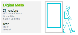
Displaying design capabilities. Billboard Poster sizes.


http://www.clearchannel.co.uk/useful-stuff/billboard-poster-sizes

About Me

My photo
Leeds College of Art. Graphic Design.
 

Copyright 2010. All rights reserved.