Archives

Thursday 22 December 2011

Lecture notes// High culture VS Low culture

In this lecture; the culture and tastes of the higher social class are explored along with their views on Art and the relationship between the higher culture and the fine arts. The notion of Avant Garde is also a strong point in this lecture, The adjective form is used in English to refer to people or works that are experimental or innovative, particularly with respect to artculture, and politics


  • The avent guard is a modernist statement, the idea of modernism is linked with the idea of progress and doing something innovative. Describing something as avent-guard describes it as better in some way.
  • Describing a haircut as Avant Garde means its experimental. A piece of typical avant garde artwork was the Marcel Duchamp style. It aimed to be shocking, sensational and radical. He was considered as the most important artist of the 20th century art scene. 
  • The creative act is not performed by the artist alone; the spectator brings the work in contact with the external world by deciphering and interpreting its inner qualifications and thus adds his contribution to the creative act. - Marcel Duchamp

    Marcel created his own brand of art, "readmades". Altering everyday objects and signing them. His most radical example of this would be the Mona Lisa alteration, he scribbled a moustache and wrote the initials 'L.H.O.O.Q', saying this in French made the initials sound as if you were saying; 'She's got a hot ass'. A comical and radical change to a famous, recognised piece of artwork.


    Research points...'Fauves' & 'LCAD'

    Concepts:

    1.     Innovation
    2.     Experimentation
    3.     Originality
    4.     Creative Genius


    Fauvism was a movement, derived from Les Fauves style of practice. The term was French for 'Wild Beasts' used to indicate an apparent lack of disciplines. The movement from 1904 - 1908 emphasised a strong use of colour over realistic values and painterly qualities, it was a wile and vibrant style of art with expressionist paintings that often shocked critics. The main artists of the time were HENRI MATISSE & ANDRE DERAIN. Critics would often call them 'Wild beasts' as they were all self taught painters, painting with an aggressive and loose style.


    Art school only attracted a handful of people because people believed art was about having the freedom to be creative.

    • If you attended art school education during the periods of the 16th, 17th and 18th century you were likely to be assigned a 'master' who's style you'd duplicate, copying their masterwork, again and again until you were graced with the opportunity to  imitate their style. Even though the artwork may not have appealed to you, the aim was to meet what the audience wanted.
    • The artists had to sell their work, if they couldn't produce work that appealed to the public, they'd fail in the industry.

An explanation of Fine Art... The Spot painting.

  • The painting was replicated only 125 times, yet each one had different coloured dots. Art was meant to be creative and hold a sense of professionalism, yet this work was designed to sell.
  • It's been sold for incredible amounts of money, when re-sold at auction it can gain more than $50.000 a piece.
  • The piece goes against the original artistic qualities which makes it so popular as its not just about creativity and expressionism.

Sunday 11 December 2011

Context of Practice 09/12/11

ONE FEMALE
Tien-Min Liao
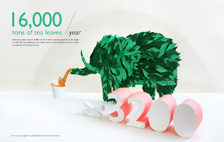
I admire her work because of its creativity and effort but also because of its proffessionalism, she graduated from the National Chengchi University in Taiwan with a BA degree in Advertising, she got The Ministry of Education Scholarship to advance her education at Pratt Institute. She was born and raised in Taiwan.
Creative fields; Graphic Design & Illustration. (She created an educational and informative tourist booklet for Taiwan, using only paper based materials to create sculptures and info-graphics).


ONE MALE
Jonny Wan
Specialising in Illustration and Character design, he creates intricate, creative and decorative designs, commercially producing them for companies such as: Ford & Microsoft.
Represented globally by Agency Rush who oversee all aspects of his commercial Illustration.


ONE AGENCY
Go media. Services include: Identity, Web, Print, Motion, Illustration & type. 

‘n 2001, the founders of Go Media Inc. made the commitment to break from the constraints of traditional design services and give the marketplace a next-generation creative agency. The belief was that the digital age was providing us tools to develop captivating pieces of art for any medium. Art that could be turned into marketing solutions for any organization, large or small. We believed that new technology could be used to enhance graphic design and reduce costs and time to market. This vision has only become clearer over the years as we continue to push the envelope and exceed our client’s expectations.’

Broad scope of work, delves into all areas of art, combining different aspects to create captivating pieces.


The research we'd gathered was then put to use using 'Designer speed dating'. This allowed us to broaden our knowledge of other designers we wouldn't usually come across. Below I've included some artists I was referred...
  • Silky Werzinger (Germany based, specializes in illustration)
  • Harriet Russell (Creates hand rendered, authentic designs. Less clean cut)
  • Taku Satoh (Packaging design, Issey Myaka Soda, 1999)
  • Julena Harrison  (Paper-cut, commercial, advertising, illustration and typography)
  • Milton Glazer (Massive, New York magazine, America, 1922, simple & effective designs)
  • Studio Output (London, Nottingham, Vector, detailed designs)
  • Church of London, agency. (East London based, good selection of designs). 
  • La Boca....

    Friday 25 November 2011

    Lecture notes// 'The Auteur'

    The Auteur is a filmmaker (usually the director) whose movies are creatively influenced and characterised by THEIR influence. Auteurs are often seen as breaking the rules and making the rules...Personification of the genre. Auteur is also French for 'Author'.

    One of the most successful and influential characters of the film industry was ALFRED HITCHCOCK. Influenced by the less 'mainstream' movements such as 'surrealism' and 'expressionism' as oppose to 'Art House'. Working for over 50 years in the film industry can only mean one thing...success. 
    Below are a few reasons why Hitchcock was so important to film;
    • The dolly zoom, an unsettling special effect caused by the cameras movement to undermine the normal visual perception in film.
    • He was a pioneer of many techniques in the suspense and psychological thriller genres.
    • The backward zoom, while travelling.
    • The 'Vertigo effect'.
    • To create tension he would cleverly use a montage and cut despite the production code (39-60)
    Montage = an assembly of pieces from film. "What is drama, but life with all the dull bits cut out?" - Hitchcock

    The Lodger 1927
    His first recognisable and acknowledged film. Explained: the choice of his music created a specific mood for each scene. The clever use of overlapping and montages created a ghostly appearance.


    Colour being used expressively; creating a sense of realism with the audience - making them suffer - bringing them into the film.


    Hitchocks impeccable style...
    Expressionism - form evokes emotion
    Cameo appearances by the director (Signature)
    The narrative is often visual as oppose to being told through a dialogue.
    Obsessive use of Blondes.
    Use of certain actors.
    &
    Suspense - "There is no terror in the bang, only the anticipation of it."

    Cinema had changed, photographs of people talking bared no resemblance to the art of cinema.

    Self Proclaimed fears
    • Small Children
    • Policemen
    • High Places
    • That my next movie won't be as good as my last.


    Saul Bass

    Colour and its meanings...

    The eye contains two kinds of receptors - rods and cones, while the rods convey shades of gray, the cones allow the brain to perceive colours.
    There's 3 types of cones. The;
    1st - sensitive to red-orange light
    2nd - sensitive to green light
    3rd - sensitive to blue & violet light.


    When a cone is stimulated, the brain perceives the corresponding colour. If our 1st cone is stimulated we see "red", if our 2nd is stimulated we see"Green". If these are stimulated simultaneously, we see YELLOW.


    Primary & Secondary
    Primary colours differ depending on the colour mode (RGB/CMYK), Colours seen when lights shone through a prism are known as Spectrum colours consisting of; RED, ORANGE, YELLOW, GREEN, BLUE, INDIGO AND VIOLET. When the base of the primary colour system is RGB (Additive), these ROYGBIV colours are reduced to red, green, blue and violet.


    Secondary Colours are simply created by mixing 2 primary colours, Using the picture as evidence we can see that when you mix red and yellow, produced is ORANGE.


    Tertiary
    These consist of browns and greys, produced by either mixing all 3 primary colours together OR mixing a primary colour and a secondary colour. There are six tertiary colors; red-orange, yellow-orange, yellow-green, blue-green, blue-violet, and red-violet.


    Symbol: Symbolises an Apple (Company name)
    Sign: it's reminiscent of Apple products e.g: iPods, iPhones and Apple Macs.
    Signifier: Suggests quality, creativity and technology.

    Visual metaphor: An object that is a representation of something else e.g. APPLE. A metaphor conveys an impression about something relatively unfamiliar by drawing a comparison between it and something familiar.

    Metonym: A symbolic image that is used to make reference to something with a more literal meaning. e.g. a Cross is usually associated with a church.

    Synecdoche: When the main subject is substituted for something that is inherently connected to it (A part used to represent the whole) e.g. The Statue of Liberty represents NEW YORK.

    Type and its meanings...

    Typography - the effective delivery of a message though the use of visual language.
    Visual Literacy - the ability to construct meaning from visual images and type.
    Visual Communication - is based on a level of shared understanding of signs, symbols, gestures and objects.


    TYPE IS SPEECH MADE VISIBLE.
    Hierachy
    An arrangement of items, in which the items are represented as being 'above', 'below' or 'at the same level as' one another. Abstractly, a hierarchy is simply an ordered set. A Hierarchy can link entities either directly or indirectly and either vertically or horizontally. This is akin to two co-workers or colleagues; each reports to a common superior, but they have the same relative amount of authority.


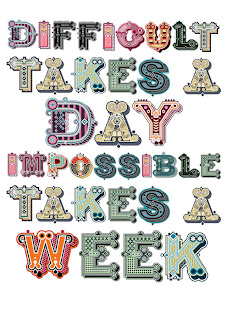
     The type below demonstrates a hierarchy of point size.


    Colour Theory / Jen Stark

    Jen Stark is a contemporary artist whose majority of work involves creating paper sculptures, her work uses inspiration from microscopic patterns in nature, wormholes, and sliced anatomy. The ideas are based on replication and infinity, echoing patterns and intelligent designs found in nature.


    Saturday 12 November 2011

    Context of Practice 11/11/11

    The task was to find 5 examples of imagery that we found aesthetically pleasing. They didn't have to be pieces of graphic design but what we personally liked...

    Unrealistic scenes by Professional Freelance Photographer NATHAN SPOTTS
    The scene looks as if it was created by merging scenic photographs, I love the smoothness of the transition, from the light clouds to the dark clouds and the slow fade of colour into the black sky. All of these things make the photograph look somewhat real.


    Work collection by Michael Kutsche
    The artist specialises in film and character design


     I admire the talent that went into these designs, at first they look like extremely detailed paintings, but as I keep looking at them I think they've also been created using design programmes, but maybe that's just because they look so perfect.


     The amazing thing about his work is that they look like actual photographs creating realism with the audience, he really captures the mood and lighting of the setting creating picture perfect designs. In the image below the light shining through the hood radiates the characters face, almost forcing you to look at the detail in the weathered mans face, the eyes slowly draw you in and create a mood.


    Layouts, illustrations & info graphics by Francesco Muzzi
    Specialising in Editorial design and Illustration. They're so aesthetically pleasing to look at because they're so easy on the eye, When I see this set of images, I'm not even considering what the text might say but admiring the style and layout choice of this artist.


    Recent Illustrations by Jonny Wan
    Although the artists using different directions he still maintains his experimental style.


    Anti-Smoke pack by Reynolds and Reyner
    Daily people are dying throughout the world of diseases, caused by smoking. This package concept shows how close this problem is to us. As every day each smoker carries this problem in his/her pocket.They carry death.


    When choosing aesthetically pleasing designs I base it on the 5 aesthetics that follow: 
    • Intricacy
    • Imagination
    • Colour use
    • Boldness
    • Graphic
    5 experiences I'd like to achieve....

    Admire the aesthetics in a city surrounded by culture and vibrancy, somewhere like Beijing.  Were the city is renowned for it's palaces, temples and huge stone walls.


    Be inspired by other aspirational designers to do something different! 


    Attend a convention or exhibition and be blown away by the imagination of a design. 

    Collaborate to create an equally brilliant design. 

    I used to work in a kitchen as a starter chef, so it would be pleasing if I found some way to exquisitely lay/stack or perch the food on a plate to massively improve the aesthetics of it.

    About Me

    My photo
    Leeds College of Art. Graphic Design.
     

    Copyright 2010. All rights reserved.