Archives

Wednesday 25 January 2012

Lecture notes// Medium Specificity

  • DEFINITION...Medium specificity is the view that the media associated with a given art form (both its material components and the processes by which they are exploited) entail specific possibilities for and constraints on representation and expression, and this provides a normative framework for what artists working in that art form ought to attempt.
  • Pitching out corrupts within
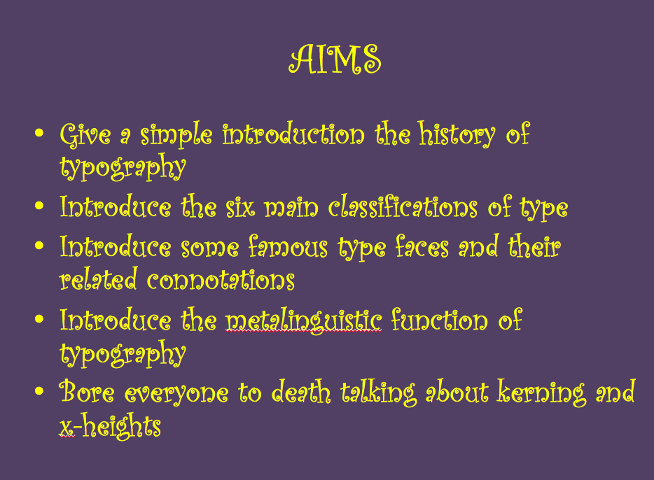
  • Tufte argues that power points make it difficult to communicate with an audience
  • A human being is a bio-social being and the subject of social forms of live, communication and consciousness
  • Our medium specificity is shaping how things can be done, Our medium specificity is that we are biological creatures. Organic in nature, we have a close genetic connection to the animal world.
  • All animals are built in a certain way to perform certain tasks etc...
  • The production of music was related to the oscillating hairs in our ears, as humans we re-created the method of this with a needle and wax, creating records etc...
  • Medium Specificity - Media associated with a given art form entails specific possibilities & constraints on representation and expression ------ Aesthetics & Art criticism ------ Closely associated with modernism but it pre-dates it ------ TRUTH TO MATERIALS ------
  •  'Clement Greenberg' Modernist art. >>>


  • In order for a medium to have certain qualities it must be grounded in a tradition that has established these qualities.
  • The medium becomes the media which is itself simply an extension of our own physical and mental limitations.
  • Technological development reflects existing human neurological development ------ Linked to Photography, Film & Animation.
  • In graphics format often rules, it can either be digital or material. Representing the physical point of contact with the user affecting how we receive a designs printed format.
  • Type formats live on as a memory of old technology.
  • The design grid is a ghost of Guttenberg from 1439.
We're currently living in a digital age. As differences between media disappear the concept of Media & their 'newness' lies in the way they remediate older media.


Wednesday 11 January 2012

Lecture notes// A History of Typography

Typography structures how certain variables are delivered, For e.g. Writing, Visual communication etc. It's a medium of communication through visuals and isn't presented verbally. The first type of messages that we find in the history records were a series of pictures that told a story known as pictographs.
-----------------------------------
Typography can express certain tones through its characteristics for e.g. Slab Serif = a very powerful bold representation. These characteristics then fell below TYPE CLASSIFICATIONS.
A similar theme is shown in the American Psycho film, displaying the impact typography can have depending on its characteristics.


The late age of print.
Following the 'dark ages' when nobody read or wrote, the late age of print began, the term was first introduced by media theorist Marshall Mcluhan, and with it Gutenberg's printing press began, creating 'moveable type' and a dramatic change in the development of the world. The period of renaissance later saved culture during its 'dark ages'.


Illustration of Guternbergs press. Guttenbergs 'Gothic Script' in 1450 was considered very difficult to read because of the spacing between letters etc.

'Uppercase' letterforms were inspired by the Roman Culture (Trajan's column 113AD) Even the modern day alphabet is taken from these original forms. 


Humanist type forms
There is little difference between the main stroke and secondary stroke, a classic feature is the upturned cross stroke of the letter 'e'. The type forms were created by Nicolas Jenson. It became the first family of type. 
Centaur (humanist) now became Garamond (old style). Which stemmed from Venice alongside the first forms of italic fonts and a different spacing of letters. At this point  in history there is a shift within typography and type which now became a form of art. Followed by the production of the other fonts such as; Palatino, Perpetua, Garamond and Goudy old style.


An 18th century english printer, William Caslon created the typeface, characterised by crisp upright characters that recall fluid strokes of the flexible steel pen and pointed quill. These modern fonts of the time were adopted by America and used for the USA's declaration, representing a modern country.


Modern typeface - often known as Didone, designed by Giambttista Bodoni. It became the most influential and attributed font to Firmin Didot, 1784.


Fashion designers commonly use Didone as it represented elegance, style and class. Vogue magazine uses this as its main typeface.

During the wave of modernism, Eric Gill designed Gill Sans

Swiss style - San Serif, Helvetica 1957, Max Miedinger, Seen as the font of corporate communication and is used widely in the business industry.

David Carson gets rid of legibility as a response to ubiquitous typefaces. 
Barry Deck 1990: Postmodernist font.


About Me

My photo
Leeds College of Art. Graphic Design.
 

Copyright 2010. All rights reserved.