Modernism
Postmodernism
Graffiti / Street Art
Film Theory
High Culture / Low Culture
A History of Type
Media Specificity
Advertising
Communication
I'll be finding 5 Designers that are related to each one of the Lectures above (Level 4 lectures). I will also need to write an explanation of why I think each designers work relates to the Lecture theme along with examples of their work.
Modernism...http://www.thinkingforaliving.org/
Walter Allner: Walter Allner, the Bauhaus-trained graphic designer and art director of Fortune magazine from 1962 to 1974. He introduced a European Modernist typographic sensibility to American magazine design....The designs are quite risky pieces of Modernism in the sense that they look quite cluttered compared to most pieces of Modernist design, which tend to have clean finishes with minimal design. Walter does however use the space effectively, the positions of his components are all thought about and positioned as oppose to Post modernist designs which look 'thrown on the page'.


Hans Neuburg: http://www.aisleone.net/2009/design/hans-neuburg/ Swiss modernist graphic designer Hans Neuburg (1904 – 1983) is one of the pioneers of the International Typographic Style along with Brockmann, Crouwel, Aicher, Hofmann, Casey.


Muller Brockman: THE PIONEER OF SWISS GRAPHIC DESIGN, JOSEF MüLLER-BROCKMANN CHANGED THE FACE OF THE GRAPHICS INDUSTRY AND INSPIRED A GENERATION. All of his work is very formatted and structured specifically, a trait of modernist design. The designs are all easy to navigate around and understand.


Harry Beck: Harry Beck, was an English engineering draftsman best known for creating the present London Underground Tube map in 1931. A simple design in terms of colour and typeface, a conventional design...Form follows function.

Post-Modernism...
April Greiman: There's often no structure to her work, her work focuses more on being innovative, exploring image, word and colour. The cover doesn't appear to communicate anything specific, I've tried, & failed to notice any form of grid or structure! All the components are randomly space, creating a composition of illegible messages.
WET covered a range of cultural issues and was widely known for its innovative use of graphic art. Started as a simple one-man operation that included artwork and text solicited from friends and acquaintances, the production, team, and circulation of the magazine would grow over the years. Its content also evolved to cover a wider expanse of stories that captured a smart and artsy Los Angeles attitude that was emerging at the same time as punk, but with its own distinct aesthetic. The magazine’s energetic creativity and flare for the absurd would remain a constant. As design problems arose, solutions were often improvised on the spot, creating a quirky and prescient editorial sensibility that remains one of WET's most enduring legacies. Its layout and design helped to catalyze the graphic styles later known as New Wave and Postmodern. http://www.wetmagazine.com/


David Carson: http://jmfinalproject.wordpress.com/2011/02/21/artist-research-david-carson-a-history/
"Don't confuse legibility with communication. Just because something is legible doesn't mean it communicates and more importantly, it doesn't mean it communicates the right thing" - David Carson.
All of his work is quite dark and gritty in the sense that it uses minimal colour, and the colours that he does use don't have a high contrast, blending well together, leaving the text to be the main source of view.


Andy Warhol: a leading figure in the visual art movement known as pop art. After a successful career as a commercial illustrator, Warhol became a renowned and sometimes controversial artist. His works explore the relationship between artistic expression, celebrity culture and advertisement. He worked in a range of media, including painting, printmaking, sculpture, film, and music. Again his work was very experimental with no solid structure.


Barbara Kruge: http://www.christianhubert.com/writings/postmodernism.html


Graffiti & Street-Art...
Banksy: A lot of his work is political and often has an underlying theme, In a way he is voicing his opinions/ attitudes which is the core element of graffiti. His works simple, free and enjoyable to look at, making him a very popular attraction for pedestrians. “A wall is a very big weapon. It's one of the nastiest things you can hit someone with.” Banksy is a pseudonymous England-based graffiti artist, political activist, film director, and painter.


Shepard Fairey: Although he's created iconic pieces and sold millions of clothing items his work still remains closely knitted to street art. He practices with a wide use of stencils & layers, and often creates murals that have strong concepts, for e.g. the infamous Barrack Obama print, which influenced an audience that he would bring Progress to the American people.


123 Klan: http://www.123klan.com/ This group of artists display how far graffiti has come since its arrival in the lower-class, starting out as a graffiti crew back in 1989 they've now succeeded in turning it into a more commercial practice for themselves.


Film Theory...
Saul Bass:
He was a graphic designer and occasional filmmaker from New York. During his career he worked for some of the most famous filmmakers of the last century, such as Alfred Hitchcock and Stanley Kubrick. He also designed some of the most iconic logos of our time such as Kleenex and AT&T's logo. In relation to film theory, though, along with his movie posters such as the iconic Vertigo poster, he also did many film sequences.


Olly Moss: A similar style to Saul Bass, using specific, minimal colour and a clever use of negative space. It often looks like he's been influenced by the 60's and 70's style of posters, using simple but
effective imagery with a twist in its construction.

La Boca Design Studio: a British design studio who specialise in design for the film, music and fashion industry. They produced a collection of poster for Darren Aronofsky's Black Swan movie.


Dean Walton: He's also adopted a similar approach to Saul Bass, using the outline as a central feature for his posters, however the actual detail and texture of the posters give it a much more hand rendered finish. Although the posters look far from their original Movie posters, they still appeal to a wide audience with their subtle finishes, the colours he uses work well together because they don't stand out too much, creating a calming effect on the viewer.


Matt Owen: After looking through these designers, it appears to be that the key to a successful movie poster is the ability to show the films concepts in little imagery as possible, the more simple...the more bold & eye-catching.


Advertising...
Bill Bernbach:
'The Legend That Was Bill Bernbach He Sold A Nazi Car & Jewish Bread. "Not To Be Different Is Virtual Suicide".'

'What made Bernbach’s vision of how to make advertising work effectively? Take the Volkswagen campaign which was launched in 1959 with the famous “Think Small” ad. If there was one ad that marked the start of the golden era of advertising, “Think Small” was the one. (NOTE: According to Advertising Age, the No. 1 campaign of the 20th century).'
UniLever: founded by the merger of Lever Brothers and Margarine Unie in January 1st, 1930. Unilever is one of the largest multinational companies of the world with humungous turnover of more than 44.262 billion. It is specialized in the production of FMCGs ranging from foods, beverages, cleaning agents and personal care products. With some of the most famous brands in its pocket such as; Lux, Axe, Sunsilk, Knorr, Dove, Rexona, Lipton, Wall’s, Blue Band, Comfort, Vim, Surf Excel, Fair & Lovely and many others, Unilever has grown large and popular.
First Worldwide Print Ads | Campaign


Dr. Mehemed Fehmy Agha: Agha introduced the use of double page spreads ("rather than a sequence of single pages"), Constructivist compositions, bleeds, and the use of famous illustrators and photographers in advertising.


Paul Rand: considered one of the most influential designers in American History. His work combined the European Modernist aesthetic with American optimism and wit. Rand’s most widely known contribution to graphic design are his corporate identities but he did his share of print and advertising. www.paul-rand.com

Leo Burnett: Leo Burnett could certainly be considered a master of symbols, his Marlboro Man, Pillsbury Doughboy and the Jolly Green Giant are all iconic symbols from his career that started in 1935. Burnett forged his reputation around the idea that "share of market" could only be built on "share of mind," the capacity to stimulate consumers' basic desires and beliefs.


A History of type...
Massimo Vignelli: http://www.logoreviews.org/tag/famous-typography-designer Vignelli was involved with filmmaker Gary Hustwit in the documentary, Helvetica, about the typeface of the same name. The Vinellis styled many corporate images, including Bloomingdales. In 1972 they designed a new signage system for the New York subway.


Eric Gill: Created typefaces include:
Gill Sans (his most famous legacy to typography)
Perpetua & Perpetua Greek
Golden Cockerel Press Type
Solus, Joanna, Aries, Floriated Capitals, Bunyan, Pilgrim & Jubilee.


Giambattista Bodoni: http://www.linotype.com/683/giambattistabodoni.html

Sumner Stone: Stone is an American type designer and the first director of the type department at Adobe Systems. He is the author of Silica, Cycles, Stoneprint and of the Stone typeface family, which includes serifed, unserifed and “informal” series.


He worked as a type designer for Hallmark Cards in Kansas City for two years. In 1972 he opens his type studio, Alpha and Omega Press, in Sonoma, California. At the same time he studies mathematics at Sonoma State University. 1979: works for Autologic Inc. in Boston as director of typography. He later holds the same position at Camex Inc. in Boston and from 1985–89 at Adobe Systems Inc. in California. Adobe’s first original fonts are Stone’s Stone Family typefaces
Other type designers;
Nicolas Jenson.
William Caslon.
Media Specificity...
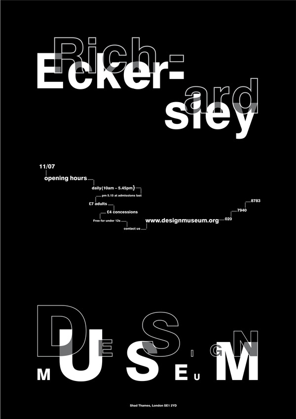
Richard Eckersley: a graphic designer best known for experimental computerized typography designed to complement deconstructionist academic works. Eckersley took a teaching position in the United States, and in 1981 he got a job at the University of Nebraska Press, where he shook up the field with computer-designed typography for Avital Ronell's Telephone Book: Technology, Schizophrenia, Electric Speech. The unorthodox design had the intended effect of breaking up the text's readability.
“Good design is the process of solving the problem posed by the manuscript.”
—Richard Eckersley
—Richard Eckersley

Allen Hori: http://www.bateshori.com/Studio "a designer dedicated to the poetics of graphic design and communication, willingly and pragmatically
pursues the resultant incongruities and surprising tangents of fancy."

Clement Greenberg: Greenberg was the greatest art critic of the second half of the 20th century and possibly the greatest art critic of all time. All this, of course, is arguable and remains so.

Tufte: An American statistician and professor emeritus of political science, statistics and computer science as Yale University. He is noted for his writings on information design and as a pioneer in the field of data visualisation. Tufte is an expert in the presentation of informational graphics such as charts and diagrams.


Medium specificity is a view that particular forms of communication require specific restraints or requirements. It is how we can judge whether a piece of design or art is good or bad. Medium specificity is closely associated with modernism, it is a way to judge aesthetics and in art criticism.
An artist that could be applied to this definition is Storm Thorgerson, An artist working with surreal elements, he often places objects out of their traditional contexts, especially with vast spaces around them to give an awkward appearance, while highlighting their beauty.


High culture vs Low culture..."The notion of Avant Garde is also a strong point in this lecture, The adjective form is used in English to refer to people or works that are experimental or innovative, particularly with respect to art, culture, and politics."
Vladimir Burliuk: Belonged to an artistically inclined family. He and his 5 siblings displayed a talent for art or literature (High culture). He attended art school in Kazan and Odessa & in 1903 Vladimir left for Munich where they studied under Anton AÏbéWhile. In the city Vladimir made important acquaintances particularly Wassily Kandinsky. Despite being abreast of the latest trends on the European art scene, Vladimir preferred to present himself as a savage with no cultural background. His works from this period were centred on depicting popular scenes or figures in a style devoid of artifice that pursued a return to the popular and was formally linked to Neo-Primitivism. In 1911 his painting moved closer to various avant-garde movement, especially Cubism.


Marcel Duchamp: a French artist whose work is most often associated with the Dadaist and Surrealist movements. Considered by some to be one of the most important artists of the 20th century. Duchamp's output influenced the development of post-World War I Western art. Duchamp challenged conventional thoughts about artistic processes and art marketing, not so much by writing, but through subversive actions. He famously dubbed a urinal art and named it Fountain.


Henri Matisse: Known for his use of colour and his fluid and original draughtsmanship. He was a painter & sculptor, known primarily as a painter. He's commonly regarded, along with Picasso and Marcel Duchamp, as one of the 3 artists who helped define the revolutionary developments in the plastic arts (Sculpting).


ADBusters: A media foundation based not-for-profit, anti-consumerist, pro-environment organisation founded in 1989. It describes itself as a 'Global Network of artists, activists, writer, pranksters, students, educators and entrepreneurs who want to advance the new social activist movement of the information age'. It publishes the reader supported, advertising-free Adbusters, an activist magazine (A form of low culture! easily replicable.) with an inter nation circulation of 120,000 devoted to challenging consumerism.


Wassily Kandinsky: He's credited with painting the first purely-abstract works. Kandinsky was unsympathetic to the official theories on art in Moscow, and returned to Germany in 1921. There he taught at the Bauhaus school of art and architecture.


Other designers:
Stefan Sagmeister: Uses a post-modern aesthetic, experimenting with type and image..often looks as if his work is an exploration (Innovative - High culture).
Damien Hirst: Has an upper class view of art, exhibiting his work around the world, earning thousands off his fine art based/ sculpted work. His work is out of the ordinary and innovative in a simplistic sense...a shark split into 3. (High Culture).
Andy Warhol: His designs are based on Popular culture and what we see on a day-to-day basis (Low culture).
Communication...
Shannon & Weaver: Their model of communication has been called the "mother of all models." It embodies the concepts of information source, message, transmitter, signal, channel, noise, receiver, information destination, probability of error, encoding,decoding, information rate, channel capacity, etc.

Harry Beck: Although I've already used Becks work, it's one the best examples to display how successful communication can be in a visual sense. He was best known for the current London Underground Tube map in 1931, he drew up this diagram in his SPARE TIME, while working as an engineering draftsman at the Signals office. Although the London Underground was sceptical of Becks radical proposal, it was introduced in a small pamphlet, immediately it became popular...& ever since the Underground has used similar types of maps to illustrate the rail network.

An issue that's being constantly communicated & constantly ignored (in a sense) is the campaign of ANTI-SMOKING, Even though there have been such creative outcomes and strong messages in their communication, they have still failed to influence all the viewers. The ad's don't hold back in terms of hurting the viewers feelings, they include harming the safety of your children and those around you, which must have a strong effect on the audience?.


Another type of campaign that adopts a similar scare tactic to communicate its message is the Drinking & Driving advertisements, Just like the smoking ads they've used a variety of mediums and focus points, including posters, radio clips, television advertisements etc...


Think!: The group create a very powerful set of posters that seem to have gained the most recognition in terms of tackling the problem of Drink driving, Most of their advertisements are based on factual information that have been advertised in such a way that they shock the audience. For example...


Are you paying over $5 per pack of cigs? I buy all my cigarettes over at Duty Free Depot and this saves me over 50% from cigarettes.
ReplyDelete