- Branding and Identity
- Packaging and Promotion
- Publication and Editorial
- Information and Way- finding
Identifying primary and secondary sources that aren't relying solely on web-based examples.
Branding & Identity;


A brand identity represents your company's values, services, ideas and personality.

---------------------------------


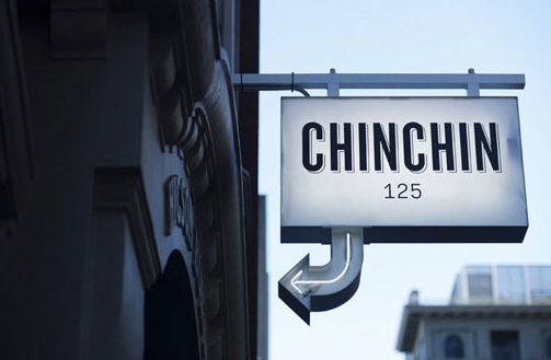
Melbourne-based studio Projects of Imagination developed the identity and collateral for Chin Chin, a “a restaurant serving no-frills, quality Asian cuisine in a dynamic & fast paced environment." The overall aesthetics bare resemblance to Japanese anime. There's nothing really amazing about this identity but at the same time it's well put together. The composition and layout of the text is all where it should be and the relationship between the colour, image and format works well. The only thing that isn't very good is that the branding only targets certain aspects of its function. I get a sense of the businesses ideas and personality...but not the services and values it holds.


Branding identity includes; Business Card, Stamp card, Menu design, Letterhead, Cup Designs,
Envelope and Coaster. Designs by Chris Cech for Dions Coffee shop. Although it's not your usual style of identity for a coffee shop, it still attracts your attention with its 'comic-book' style graphics and soft use of colours. This type of branding strongly appeals to me because it involves well finished illustrations that should be appreciated by everyone, simply for the time and talent that's gone into the values of this identity.


Great Identity for Arrogant Butcher by TunnelBravo, a Design Studio from the USA. The 'Quality food & Premium drinks' really shines through the sleek and clear style of its branding, they haven't jeopardised the communication of its identity by putting too much into it, but created something distinctive.

Eric Yerke - Anthony Lane - Logo, Branding and Identity Design | Minneapolis, MN. An extensive amount of developments clearly gone into this Identity because it incorporates multiple layers and embossing which when replicated numerous times is a very time consuming process. But its definitely paid off, producing a very simplistic, innovative and striking appearance for this photographer. The cut out almost acts as a lens in the sense that your having to view the information through another layer...just as a photographer would.


Brand identity for an innovative yet simple piece of software used by waste management sites to detect blockages and keep things flowing through the pipe network. Simplistic, Striking & attractive. At first I didn't really appreciate the design because I've seen numerous attempts at this approach, but after further investigation the concept for this brand is excellent. And what makes it even better is that certain aspects connect together...just as a pipe network would.

Packaging & Promotion


Promotion encourages the publicity of growth and progress, it can be delivered in a number of ways, including Packaging. This involves the creation of attractive visuals to build a brand identity, it needs to be eye-catching but at the same have an impact on the consumers a-swell as preserve the contents.


Designed by http://www.andreaskrapf.de **I love the direction of the designers work, engaging, fun and most of all appealing, The goal of the brief was to create a unique and fun packaging for the Denada T-shirt. The tin package can be used as a storage container after unpacking the order.

Designed by http://f26.ru
The concept behind this production is based on "the beauty of the English phrasing and the special emotions one shares when savouring a certain syrup" The common impact of this design is straightforward with a curly look..."Roll it on the tip of your tongue to sweeten your senses"


Introducing Rolling Words, Snoop Dogg’s smokable songbook. A promotion for Snoop Dogg’s Kingsize Slim Rolling Papers created by San Francisco agency Pereira & O’Dell. Each page is a rolling paper with Snoop’s greatest songs and lyrics written on them – in non-toxic ink – for your rolling pleasure. The pages are perforated making them easy to detach. The book is made of hemp-related materials, with the cover, binding, and internal lining all made from hemp seed paper while the spine of the book is a match striking surface. The book perfectly conveys the Rappers identity through its choice of materials and appearance. Smoking Marijuana is often publicised as negative and seen in a dark light, having a strong relationship with 'Chav's. Pereira has managed to change this attitude accordingly to the client.


Part of a new limited wine series designed to address a market segment well known for its general distrust towards the wine products: the night clubs/lounge bars arena. The cliental needed a packaging concept that will standout among the much shinier presence of beer, liqueurs and other spirits. Designed by 'Spotlight'.

The task at hand was to create a striking visual concept for a vodka bottle. The brand name Fire Fighter, the bottle design, and the slogan “Use in case of party” were created by Timur Salikov to serve a very clear purpose – 'people want to have this product.'

The brief was to develop a packaging design that would communicate the 'the different in quality, the refined character and the exceptional origin of our product.' The target audience: An electric but low-key clientele. The actual creative agency that produced this product consists of even designers, an illustrator, a photographer, a creative strategist and an office manager, mousegraphics works together with its clients as much in the development of full strategic proposals and plans, as in the realisation of targeted, partial applications. mousegraphics has a considerable expertise in packaging design.
Publication and Editorial


A publication is a printed and distributed material that communicates information to the public.


The only Editorial work that ever stands out for me are the ones that try something experimental and new, we've become too used to the normal columns and grids; of newspapers and commercial magazines that its often hard to find anything special in the public domain. So it's always refreshing to see something totally abnormal...but still understandable.


Editorial/ magazine layout. The client is Kaledi, arts and culture magazine. Background information: Kaleidi was developed from the word Kaleidoscope which refers to constant changing of shapes and colours within art, culture and fashion. The triangles which make up the logo continue as a branded theme throughout the magazine allowing for some very creative layout designs.


Information and way-finding

Way-finding allows people to find a specific destination/ orient themselves to navigate from place to place.
http://www.behance.net/search?sort=appreciations&time=week&content=projects&search=wayfinding


Inspired by compass navigation and maps, Walkit is a simple device that provides a basic sense of orientation. It's unique selling point and purpose is to avoid the turning of big maps in confusion, following a line, or being lost – without forcing a certain route, one can intuitively navigate, explore, and enjoy the city.

The signage was developed with the aim to provide wayfinding for the exterior of the entire area and for the interior of each building. Its concept is based on the idea of an electronic or digital circular of information. The main interior directional signs comprises of acrylic ribbons, internally light by LEDs. Referencing information cables running through a building the internal directional signs come out of the walls and go and back in again. Further navigation is provided by floor-numbers. On the exterior the directional signs and the building numbers are folded steel structures.

Dynamic approach to way-finding, allowing people to orient themselves without stopping and reading the signs, resulting in a more efficient journey.

A fun and modern approach, engaging the viewers.

I really like the identity of this way-finding. It looks perfect for the aesthetics of the hotel, it's not too bold or big and really tells us a lot about the personality/ ethos of the hotel!
Primary Sources;
Packaging & Promotion
I've diversified my research, focusing on the Wine Industry, trying to understand the different approaches businesses take to exploit their brand.

As you can see from the following photographs there is a very broad range of approaches to the way the contents advertised, the most likely reason for this is probably because the range of available wines to a consumer is so extensive that companies are being forced to produce something innovative and different to even stand out.

Alternative take on the old 'baseball cards' you often see in films etc/ Similar aesthetics to a beer mat found in pubs. Despite the imagery, there doesn't seem to be enough information to actually justify the personality of this bottle. With a-bit more development it could of been a lot more successful. Proposal: Extending the left-hand side by adding a rectangular...thinner section.

As with most things, the price often reflects the quality of the good. Which is certainly the case for wine, as the price got higher, the labelling & printing techniques got more technical and the casing became more extravagant.

Branding & Identity


Information & Way-finding


No comments:
Post a Comment