As a starting point for this brief I needed to educate myself on what Leeds brewery was all about, the concentration for this brief was on their new bottled british beer; 'Hellfire'. I needed to find out what they were currently doing to connect with the people and what people already thought of their beer.

Creative Networks - Creative Networks aims to support partnerships and collaborations in the creative industries, public and private sectors in Leeds through providing a range of high quality events and an inspiring environment where creatives, partners, colleagues and students can mix. You can also keep up to date with news and updates by following us on twitter at @creativenetwrks

The Best of British Beer - providing the finest choice of beers with brewery information and tasting notes to enhance your drinking experience.

Leeds Brewery - Existing Pump Beers/ Seasonal and Permanent beers.


The current label for Hellfire - Although the quality of design is quite poor and of a standard quality, it does a good job of standing out against a crowd of beers simply for its brightness and bold use of colours.

The man featuring in this video is a keen enthusiast when it comes to british beers and delivers a step by step examination of 'Hellfire' after review I noted down some key points for expansions including
- Rating 9/10
- Malty
- Bitter, spicy smell
- British hops
- Makes reference to orange peel?
- SUMMER BEER
The Leeds Coat of Arms
Why are their Owls on the Leeds Coat of Arms? The Leeds coat-of-arms developed over a period of time. These owls came from the coat-of-arms belonging to Sir John Savile the first Alderman of Leeds. There are lions, dragons and other beasts that appear on coat-of-arms but in Leeds we have magnificent owls.

Could the style of hot sauce somehow be incorporated into the beer design? Ever since the arrival of Nando's and their peri-peri sauce, there's been a huge consumption of hot sauces and attraction to their fiery labels. (The style would be reflective of the spicy smell of 'Hellfire')

Creative & Inspiring....
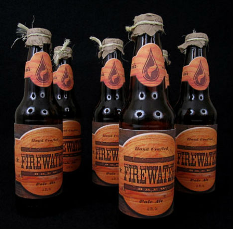


If you look at the 'hellfire' label and make comparisons to the label below, you can see that their approaches share a synergy with one another, both use predominately text to communicate their messages, the only difference is that the designs below are of a much higher quality, they communicate a rich and traditional beer without the overuse of colour! Through the label design alone, I'd say the beer below is the more expensive option.


The design above really caught my eye because it reminded me of a propaganda poster, this style has seen a comeback since the works of Shepard Fairey. The surrounding artwork, around the main feature of this design compliments the 'Gargoyle' very well, it almost looks as it it's hailing the character or introducing it in the best way it can represent it.


No comments:
Post a Comment