Friday, 6 April 2012

Lecture Notes// Communication Theory

This lecture outlines the processes in how we communicate and get through to other people. There've been multiple theories and perspectives that have shaped the field of communication studies. There are different levels of potential communication problems;
Level 1- Technical (Accuracy)
Level 2- Semantic (Precision of language, accents)
Level 3 - Effectiveness (Does the message have the desired outcome)
These concepts about communication are quite new, originating in the 1940's. A problem that's highlighted the importance of efficient communication is when the United States sent two bombs to Japan at the the end of the world war, the reasons for this was said to be a lack of communication with the Japanese government due to language boundaries. 
The information or Cybernetic theory of Communication
Shannon and Weaver Bell Laboartories (1999)

As a designer we have to think about what the aspect of the message is along with how we choose our language (not just verbally). As a designer our source are the clients, audiences are constantly changing, along with the break down of categories concerning age. Audience categories: Individuals, adults, men, women, children, housewives.
These are further subdivided by age:
Semiotics- Three basic concepts:
1.Semantics- addresses what a sign stands for
2.Syntactics- is the relationship among signs
3.Pragmatics- studies the practical use and effects of signs

Audience and social class - Theory doesn't work without knowledge of the audience
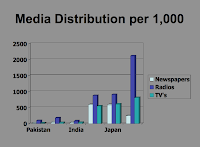
Media distribution - Newspapers, Radio, TV's, RADIO IS THE HIGHEST AND MOST USED FORM OF COMMUNICATION IN JAPANS SEMIOTICS.
Semiotics; Can be useful when you need to make meaning from a given framework. Breaking down into code.
The phenomenological Tradition; This is the process of knowing through a direct experience, it's the way in which humans come to understand the world. Phenomenon refers to the appearance of an object, event or condition in one’s perception. Makes actual lived experience the basic data of reality.
A failure in communication can be seen as an absence of, or failure to sustain, authentic human relationships
Merleau-Ponty "The theory of the body schema is, implicitly, a theory of perception in which our own body is the world as the heart is the organism: it keeps the visible spectacle constantly alive, it breathes life into it and sustains it inwardly, and with it forms a system. The weakness of Merleau-Ponty’s position is grounded in his attachment to semiotics.
Hermeneutic Phenomenology; Beginning around 100 years ago being taught to Romans, it's originally referred to the study of religious texts.
A hermeneutic circle is a Metaphor, from the Greek word...
"transfer is language that directly compares seemingly unrelated subjects or activities".

The corporeal turn - The embodied mind; communication through visuals and facial features. Communication is seen as an extension of the nervous system. It starts with an awareness of the body. Language is seen as part of that system existing as neuronal pathways that are linked within the brain. The key is a physiological classification of coding and encoding.

- Starting early: face recognition


Wednesday, 29 February 2012

Lecture Notes// Fashion as Photograph

Focusing on the difference between photography & the relationship between the body, model & Photographer. And to see how trends influence the public perception.

William Henry Fox Talbot, INVENTED A FIXING PROCESS, calotype - process using silver nitrate. (Destruction of the negative)

(Virginia Oldoini, Countess di Castiglione, photographed by Adolphe Braun, 1856...had around 280 photographs of her, in a way she is one of the first fashion models, focusing more on her character (i.e. personality, directing the shoot, signature moments of her life.) 

Another photo by Pierson 1861-1867 - the image really challenged taboo and sexual focus, photographing only her legs & feet which was frowned upon at this period.

Age of the fashion magazine, improvements in the halftone printing (dot) process. 

Paul Poiret ---- freedom from corsetry, signature shapes - hobble skirt, harem pants. Influenced by antique dress - draping. Can see this in his designs -- Art et Decoration, 1911. Edward Steichen photographs Paul Poirets design.

Mid 1930s - hype of modernism. EDWARD STEICHEN, major detail, lit theatrically, display the materials, what the experience is perceived to be. celebration of the technical construction of the garment aswell as the photographic construction.

Vogue vs Harpers Bazaar..... Leaders in fashion photographs in the 1920s and 30s.

Horst P Horst costume for Salvador Dali's 'Dream of Venus'. 1939.

British Vogue - Cecil Beaton (1904-1980) & Vanity fair.
Photographed and was a member of the 'British Young Things' of the 1920s/30s.
Prolific diarist.
Designed sets, costumes, and lighting for Broadway.
Scope of his work - also interested in the film industry, Vivien Leigh for Vogue, mid 1930's  encapsulates all his interests in one photograph. 

Women fashion photographers - Lee Miller - Photographed by Steichen, American photographer and fashion model at age 19.

Photographer - Goes to Paris in 1929 with photographer Man Ray - Involved in the surrealist movement in photography ---- Also acts as a war correspondent. 

Panorama of Paris, Suzy Parker in Jacques Fath Gown, 1953. Visual contrast in the sense that the character in the background who is part of this image is wearing black whereas in the foreground the woman is wearing white, highlighting the focus of the photograph.

American photographer - Richard Avedon (1923-2004) Harpers Bazaar till 1966, Vogue 1966 onwards, The book 'In the American West'. (Art documentary field.)
Pioneer of an in-between moment in fashion photography, tends to photograph people in an emotional/ movement state breaking the norms of photography.

Helmut Newton (1920-2004) Vogue and Harpers Bazaar.


Guy Bourdin for Charles Jourdan shoes


I-D magazine VS The Face. Fashion magazines that encompassed a whole new attitude and face of leadership, all really a trend towards Heroin sheep.....Juergen Teller (1964) German photographer, photos in the face of Vogue. Has worked with Vivienne Westwood etc.

Corrine Day (1965-2010) British fashion photographer and model, worked for the Face & Vogue. Vogue cover with Kate Moss credited with the beginnings of the trend for the 'waif' look.

ADOBE PHOTOSHOP - MASSIVE FACTOR IN FASHION PHOTOGRAPHY.
Digital image manipulation - graphics editing programme - first launched in 2003.
Nick Knight - Manipulations a big part of his work which is heavily influenced by Architecture. Worked with Yohji Yammamoto in the 90's and with Alexander McQueen.

Fashion Blogging, Democratises fashion photography. Anyone can write about/ photograph fashion. E.g. Tavi Gevinsons 'style rookie'. 

Street-style Copenhagen... http://copenhagenstreetstyle.thepop.com/

Further Reading ========== Barnard, M (2002) Fashion as Communication. Routledge, London
Rankin, (2009) Seven photographs that changed Fashion, BBC4.

Wednesday, 15 February 2012

Lecture notes// A history of Advertising

This lecture's linked to social media and communication. Exploring how large-scale color printing technology has developed since its arrival in the 19th century.
'The beginning by Wight' - Advertising, the most fun you can have with your clothes on.
-Bill Bernbach, the first person to combine Copywriters & art directors, Along with Hegarty, the pair were two creative advertising giants.


'Bill Bernbach, the legendary founder of Doyle Dane Bernbach, ignited the creative revolution and changed the world of communications and business forever. He was a philosopher, a scientist, a humanitarian. And his influence was felt well beyond the world of advertising. As our industry faces a new creative revolution, Bernbach's ideas and keen insights into human nature may be more relevant than ever.'


Lever - the First British Tycoon - To build a gallery & open it up for the public, it was the year of  the crystal palace exhibition.


Lever was born in 1851 & Prompted by the Promotional stimuli that surrounded him. He was born at the height of the empire, & the international exhibition prompted large scale color printing in the 1860's. 
It was during the 1860's that cereal companies figured how to; print, fold & fill boxes mechanically.

The Advertising Boom - this allowed taxes on newspapers to be abolished in 1855 + in 1861.
This made it more reasonable to advertise in the papers.
A second Boom - this consisted of a technological progress; reproduction, color printing and 
pictorial ads in the 1880s.
Lever Brothers founders: James Darcy & William Hesketh Lever (1885).
By the 1890s technology enabled contemporary paintings to be reproduced. The sunlight soap.


Target audience; Women. High feelings and emotive contexts displayed the mother daughter bond that could be achieved. Advertising transformed a local soap manufacturer in 1885 to one of the worlds leading brands
Innovative events such as Democratization caused the Royal Endorsement - meaning everyone should be able to afford soap etc.

Imperial Mission - Lewis. We needed to be civilised, 'there was no commodity needed more than this soap'. It could wash the natives and cleanse the great unwashed of Britain's working class.
The notion of imperialism was advertised through Posters and Packaging, appealing to a wide audience. This was because the Empire was celebrated on biscuits, cigarettes, soap & chocolate = Part of the working class fabric.

  Investing in Advertisement cost Lever £2 million within the first 2 decades of marketing soap. 
In 1890 Lever purchased a Philadelphia soap firm and others like it.
First Creative Advertising


Selecting & Presenting Contemporary art works communicated a more powerful desired message.
The message was told in an interesting and innovative way.
The imagery provided a spectacle.
By adding simple endlines, Lever managed to change the meanings of images to his advantage.
Art Direction 
Gross suggested 'Plantol' (Another soap company) should depict tropical climates and express the care that is exercised in refining oils. Whereas it was simply a vision to disguise the forced slavery. Palm Oil was one of the main ingredients.
Innovative ideas of getting the consumer to buy the product consecutively. For example, saving coupons to receive an advert print and in the 1890's capturing the children to receive paper dolls with interchangeable outfits.
Ad expertise = the power of truth, the trick is to tell the truth, but make it interesting. Truth can be Disarming.
Audiences - to convince peoples they did not want but need this product. 

Uni Lever now has 900 brands...

Wednesday, 25 January 2012

Lecture notes// Medium Specificity

  • DEFINITION...Medium specificity is the view that the media associated with a given art form (both its material components and the processes by which they are exploited) entail specific possibilities for and constraints on representation and expression, and this provides a normative framework for what artists working in that art form ought to attempt.
  • Pitching out corrupts within
  • Tufte argues that power points make it difficult to communicate with an audience
  • A human being is a bio-social being and the subject of social forms of live, communication and consciousness
  • Our medium specificity is shaping how things can be done, Our medium specificity is that we are biological creatures. Organic in nature, we have a close genetic connection to the animal world.
  • All animals are built in a certain way to perform certain tasks etc...
  • The production of music was related to the oscillating hairs in our ears, as humans we re-created the method of this with a needle and wax, creating records etc...
  • Medium Specificity - Media associated with a given art form entails specific possibilities & constraints on representation and expression ------ Aesthetics & Art criticism ------ Closely associated with modernism but it pre-dates it ------ TRUTH TO MATERIALS ------
  •  'Clement Greenberg' Modernist art. >>>


  • In order for a medium to have certain qualities it must be grounded in a tradition that has established these qualities.
  • The medium becomes the media which is itself simply an extension of our own physical and mental limitations.
  • Technological development reflects existing human neurological development ------ Linked to Photography, Film & Animation.
  • In graphics format often rules, it can either be digital or material. Representing the physical point of contact with the user affecting how we receive a designs printed format.
  • Type formats live on as a memory of old technology.
  • The design grid is a ghost of Guttenberg from 1439.
We're currently living in a digital age. As differences between media disappear the concept of Media & their 'newness' lies in the way they remediate older media.


Wednesday, 11 January 2012

Lecture notes// A History of Typography

Typography structures how certain variables are delivered, For e.g. Writing, Visual communication etc. It's a medium of communication through visuals and isn't presented verbally. The first type of messages that we find in the history records were a series of pictures that told a story known as pictographs.
-----------------------------------
Typography can express certain tones through its characteristics for e.g. Slab Serif = a very powerful bold representation. These characteristics then fell below TYPE CLASSIFICATIONS.
A similar theme is shown in the American Psycho film, displaying the impact typography can have depending on its characteristics.


The late age of print.
Following the 'dark ages' when nobody read or wrote, the late age of print began, the term was first introduced by media theorist Marshall Mcluhan, and with it Gutenberg's printing press began, creating 'moveable type' and a dramatic change in the development of the world. The period of renaissance later saved culture during its 'dark ages'.


Illustration of Guternbergs press. Guttenbergs 'Gothic Script' in 1450 was considered very difficult to read because of the spacing between letters etc.

'Uppercase' letterforms were inspired by the Roman Culture (Trajan's column 113AD) Even the modern day alphabet is taken from these original forms. 


Humanist type forms
There is little difference between the main stroke and secondary stroke, a classic feature is the upturned cross stroke of the letter 'e'. The type forms were created by Nicolas Jenson. It became the first family of type. 
Centaur (humanist) now became Garamond (old style). Which stemmed from Venice alongside the first forms of italic fonts and a different spacing of letters. At this point  in history there is a shift within typography and type which now became a form of art. Followed by the production of the other fonts such as; Palatino, Perpetua, Garamond and Goudy old style.


An 18th century english printer, William Caslon created the typeface, characterised by crisp upright characters that recall fluid strokes of the flexible steel pen and pointed quill. These modern fonts of the time were adopted by America and used for the USA's declaration, representing a modern country.


Modern typeface - often known as Didone, designed by Giambttista Bodoni. It became the most influential and attributed font to Firmin Didot, 1784.


Fashion designers commonly use Didone as it represented elegance, style and class. Vogue magazine uses this as its main typeface.

During the wave of modernism, Eric Gill designed Gill Sans

Swiss style - San Serif, Helvetica 1957, Max Miedinger, Seen as the font of corporate communication and is used widely in the business industry.

David Carson gets rid of legibility as a response to ubiquitous typefaces. 
Barry Deck 1990: Postmodernist font.


Thursday, 22 December 2011

Lecture notes// High culture VS Low culture

In this lecture; the culture and tastes of the higher social class are explored along with their views on Art and the relationship between the higher culture and the fine arts. The notion of Avant Garde is also a strong point in this lecture, The adjective form is used in English to refer to people or works that are experimental or innovative, particularly with respect to artculture, and politics


  • The avent guard is a modernist statement, the idea of modernism is linked with the idea of progress and doing something innovative. Describing something as avent-guard describes it as better in some way.
  • Describing a haircut as Avant Garde means its experimental. A piece of typical avant garde artwork was the Marcel Duchamp style. It aimed to be shocking, sensational and radical. He was considered as the most important artist of the 20th century art scene. 
  • The creative act is not performed by the artist alone; the spectator brings the work in contact with the external world by deciphering and interpreting its inner qualifications and thus adds his contribution to the creative act. - Marcel Duchamp

    Marcel created his own brand of art, "readmades". Altering everyday objects and signing them. His most radical example of this would be the Mona Lisa alteration, he scribbled a moustache and wrote the initials 'L.H.O.O.Q', saying this in French made the initials sound as if you were saying; 'She's got a hot ass'. A comical and radical change to a famous, recognised piece of artwork.


    Research points...'Fauves' & 'LCAD'

    Concepts:

    1.     Innovation
    2.     Experimentation
    3.     Originality
    4.     Creative Genius


    Fauvism was a movement, derived from Les Fauves style of practice. The term was French for 'Wild Beasts' used to indicate an apparent lack of disciplines. The movement from 1904 - 1908 emphasised a strong use of colour over realistic values and painterly qualities, it was a wile and vibrant style of art with expressionist paintings that often shocked critics. The main artists of the time were HENRI MATISSE & ANDRE DERAIN. Critics would often call them 'Wild beasts' as they were all self taught painters, painting with an aggressive and loose style.


    Art school only attracted a handful of people because people believed art was about having the freedom to be creative.

    • If you attended art school education during the periods of the 16th, 17th and 18th century you were likely to be assigned a 'master' who's style you'd duplicate, copying their masterwork, again and again until you were graced with the opportunity to  imitate their style. Even though the artwork may not have appealed to you, the aim was to meet what the audience wanted.
    • The artists had to sell their work, if they couldn't produce work that appealed to the public, they'd fail in the industry.

An explanation of Fine Art... The Spot painting.

  • The painting was replicated only 125 times, yet each one had different coloured dots. Art was meant to be creative and hold a sense of professionalism, yet this work was designed to sell.
  • It's been sold for incredible amounts of money, when re-sold at auction it can gain more than $50.000 a piece.
  • The piece goes against the original artistic qualities which makes it so popular as its not just about creativity and expressionism.

Sunday, 11 December 2011

Context of Practice 09/12/11

ONE FEMALE
Tien-Min Liao
I admire her work because of its creativity and effort but also because of its proffessionalism, she graduated from the National Chengchi University in Taiwan with a BA degree in Advertising, she got The Ministry of Education Scholarship to advance her education at Pratt Institute. She was born and raised in Taiwan.
Creative fields; Graphic Design & Illustration. (She created an educational and informative tourist booklet for Taiwan, using only paper based materials to create sculptures and info-graphics).


ONE MALE
Jonny Wan
Specialising in Illustration and Character design, he creates intricate, creative and decorative designs, commercially producing them for companies such as: Ford & Microsoft.
Represented globally by Agency Rush who oversee all aspects of his commercial Illustration.


ONE AGENCY
Go media. Services include: Identity, Web, Print, Motion, Illustration & type. 

‘n 2001, the founders of Go Media Inc. made the commitment to break from the constraints of traditional design services and give the marketplace a next-generation creative agency. The belief was that the digital age was providing us tools to develop captivating pieces of art for any medium. Art that could be turned into marketing solutions for any organization, large or small. We believed that new technology could be used to enhance graphic design and reduce costs and time to market. This vision has only become clearer over the years as we continue to push the envelope and exceed our client’s expectations.’

Broad scope of work, delves into all areas of art, combining different aspects to create captivating pieces.


The research we'd gathered was then put to use using 'Designer speed dating'. This allowed us to broaden our knowledge of other designers we wouldn't usually come across. Below I've included some artists I was referred...
  • Silky Werzinger (Germany based, specializes in illustration)
  • Harriet Russell (Creates hand rendered, authentic designs. Less clean cut)
  • Taku Satoh (Packaging design, Issey Myaka Soda, 1999)
  • Julena Harrison  (Paper-cut, commercial, advertising, illustration and typography)
  • Milton Glazer (Massive, New York magazine, America, 1922, simple & effective designs)
  • Studio Output (London, Nottingham, Vector, detailed designs)
  • Church of London, agency. (East London based, good selection of designs). 
  • La Boca....

    About Me

    My photo
    Leeds College of Art. Graphic Design.
     

    Copyright 2010. All rights reserved.