(Sourced from Behance.net)
Typography
Typography

I love the creativity, detail and thought process of this design. It's obviously been through a lot of development stages because it contains; different font details, shadows, highlights and a varied flowing colour scheme.


The surrounding design subtly compliments the center text, it's used only two colours yet speaks class, funk and fun. I can't see a flaw in sight, all the shadows are correctly placed making it look almost real.
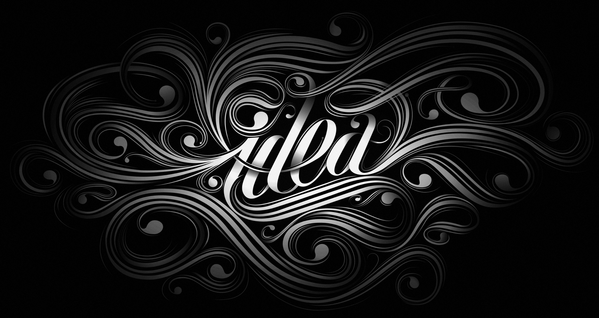
Type experiments - Jordan Metcalf


The image below is very striking, the text reads 'PUNK in the house' and displays effective gradient changes and shadowing, the overall result is a detailed, 3D text in the form of two fonts. The idea of 'Punk' is further emphasised by the guitars, and stiff text. While the 'house' is curved, symbolic of the vinyl at the bottom.

Typefunkography - Rodrigo Francisco


I chose to include the piece below because it was uniquely created, through a collaboration of peoples work. The aesthetics create a very; vintage, raw and hospitalised piece, even the colour of the 'YOU LOVE' relates to the message the design is communicating, body fluids...water and blood.

Illustration

It's rare that you see such a detailed design process where the artist relies more on developed drawing techniques than using a computer the majority of the time. The design is a collaboration piece, presented by Dirty Dozen and was communicating the story of a US Army Major who is assigned to train and lead a dozen convicted murderers to a suicide mission on a French chateau held by top Nazi officers during the World War II. I think the gritty appearance compliments the concept.


Super Happy Times, a series of die cut Gift tags. Although this style is becoming more apparent, this collection has been given a different function, gift tags, making it original. The comical approach makes them entertaining.


The detail in the designs is exquisite, creating beautiful pieces and giving you so much to look at, in just one character. If I looked at this design in 5 years, it would still look as fresh as it does now. When you first see the designs you look within the detail expecting to see something, only to find out the detail is the picture itself.


Logo


Their designs are appealing because they've been in the business for so long and managed to keep up with the times, constantly releasing different designs for a number of target markets that all look crisp and professional, as the following images show.


Their Logo has been worldwide known for a long period of time, a generic brand. No matter what you type in this font, you'll always be reminded of Coca-Cola and its eye catching color scheme. Even when you see this simplistic, Eco friendly packaging! it still has the same effect as the colored bottle.


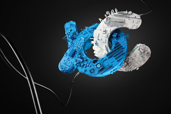
Photography

Such an original idea, executed perfectly. The way its been captured, makes it look as if the text has linked in mid-air and is just beginning to descend. The protruding objects on the letters give it a more 3D feel and give the audience something to look out, I've been trying to work out what's actually on the letters, so far I can see a group of characters on the top of the 'C'.
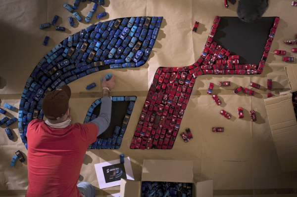

A good use of equipment, what better way to communicate a logo that represents CARS than using a mass of tiny cars?


No comments:
Post a Comment