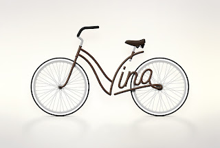
After my crit, it was apparent that I needed to make the text look more feminine rather than something that was appealing to myself. The initial font looked too industrial and needed change. I decided, a more direct approach was needed, using Lizzie's answers from her questionnaire more literally, I began to go back to my roots of investigation, and look at cursive writing.
I thought Art Nouveau would of been a good starting point, as the type's very decorative. Elizabeth also said the first memory she can remember was being chased around by a frog in her dream, I could also incorporate this into my new font...
Si Scott
This artist is suitable for my research because intricacy and swirls are a big part of his work. Creating stunning typefaces on black and white backgrounds...
I wanted to explore how readable cursive text would be if I decided to join the letters in my alphabet using a cursive typeface...
I think it would look quite good if I made the joining of all my letters visible as oppose to a solid black font.


No comments:
Post a Comment